

The Outcome
While I wasn't able to gather baseline data from the original app—i.e. time on task, customer satisfaction score—the new app was positively received by students, librarians, and administrators.
Qualitative
QUOTES FROM LIBRARIANS ABOUT THE SYSTEM
- “You’ve given us a ten-course meal!”
- “I like it!”
QUOTES FROM STUDENTS ABOUT THE SYSTEM
- “Great job. This was easy to do.”
- “Quick and easy! Nice.”
Quantitative
NUMBER OF 1-ON-1 MEETINGS
- Increased by 1.6%.
Context
Each semester, 1300+ students come to the BYU Library to attend hour-long library instruction sessions taught by subject-specific librarians—outside of regular university class time—to fulfill class requirements.
There was an existing application that was failing to meet the needs of librarians, students and administrators. I was tasked with designing a new system that would meet the needs of each group.
There was an existing application that was failing to meet the needs of librarians, students and administrators. I was tasked with designing a new system that would meet the needs of each group.
Timeline
Summer 2016–Winter 2018
Total Elapsed Time: ~18 months

SO YOU’RE AWARE
Any of the 60+ BYU Library web projects—not always UX related—can be added or removed from my project queue at any time based on priority, time constraints, or other reasons.
As project priorities change, a project that only requires 1-8 months of total design and development time often end up spanning up to a year and a half—or more—from start to finish.
As project priorities change, a project that only requires 1-8 months of total design and development time often end up spanning up to a year and a half—or more—from start to finish.
Metrics of Success
QUALITATIVE FEEDBACK + TASK COMPLETION
- Increase ease of use of the system for librarians
- Increase ease of use of the system for students
- Increase ease of use of the system for administrators
QUANTITATIVE FEEDBACK
- Reduce # of 1-on-1 sessions taught by librarians.

Learn + Map
Together, Jessica and I began by documenting all of the existing pages
across the entire Lendio ecosystem—both product apps and marketing pages. From there, we identified all of the different typographic styles being used across all of these pages, along with the padding/margin amounts between elements.
across the entire Lendio ecosystem—both product apps and marketing pages. From there, we identified all of the different typographic styles being used across all of these pages, along with the padding/margin amounts between elements.
ACTIVITIES
- Identifying charter
- Identifying/auditing existing pages
- Interviewing designers
- Interviewing developers
- Interviewing marketers
- Strategic implementation planning
- Conducting comparative analysis
DELIVERABLES
- Charter reference doc
- Figma doc of existing pages
- Spreadsheet of designer responses
- Word docs of developer responses
- Word docs of marketer responses
- Strategic implementation plan
- Comparative analysis results
Audience Roles
- Students
- Subject librarians
- System Administrators
Jobs-to-be-Done: Summary
For this project, I used the jobs-to-be-done framework to understand and design for meeting user needs and goals. There were dozens of jobs-to-be-done that I create for each user group, but these give a general overview.
FOR THE STUDENTS
When I go to sign up for library instruction, I want to be able to submit and update my availability, so I can be assigned a session or participate in a 1-on-1 meeting, so I can get credit for my class.
FOR THE LIBRARIANS
When I schedule sessions, I want to be able to scheduled them based on student availability, teach those sessions, and record one-on-one meetings, so I can give the students the information they need during their session as well as credit for attending.
FOR THE ADMINISTRATORS
When I set up the polling, scheduling, and instruction periods for an instruction type block, I want to be able define the amounts of time for the polling, scheduling, and instruction periods for an instruction type, generate reports from each of those periods, and send those reports to the students’ professors, so I can give students credit for their attendance and set up the timeframes for instruction to take place.
IN GENERAL
Most jobs-to-be-done for each of the user groups fell into one of three periods of time that made up an instruction block within the application:
- The polling period—The time during which students submitted/updated their availability.
- The scheduling period—The time during which librarians scheduled sessions.
- The instruction period—The time during which librarians taught sessions and administrators began generating reports.

OWNING A MISTAKE
For the first few weeks of the learning and understanding phase I assumed that I knew what the librarians and students wanted and needed in the new application.

Design + Test
With interviews and contextual inquires done, I moved on to diagramming, designing, and prototyping an interface for the students and the librarians to use across the three time periods—polling, scheduling and instruction. The administrator’s dashboard was created using the Django dashboard.
ACTIVITIES
- Diagramming new workflows
- Info. Architecture creation
- Wireframe mockup creation
- Visual design mockup creation
- Interact. design mockup creation
- HTML/SCSS mockup creation
DELIVERABLES
- Workflow diagrams
- Wireframes mockups
- Visual design mockups
- Zeplin JS functionality specification doc
- HTML/SCSS mockups
- HTML/SCSS specification doc
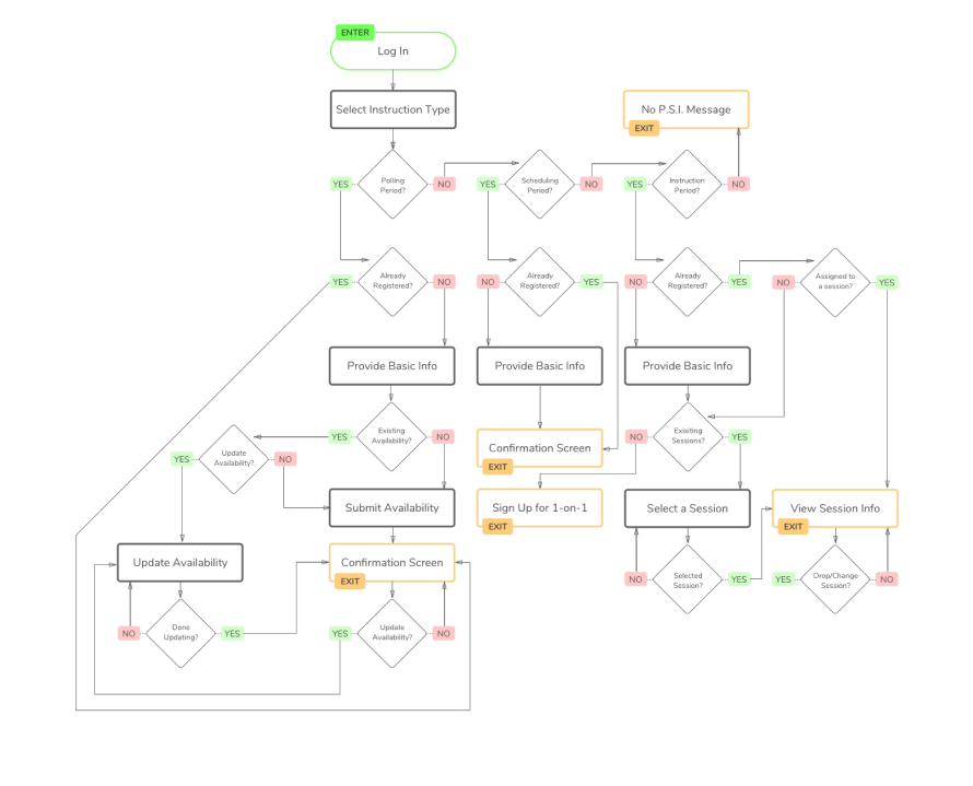
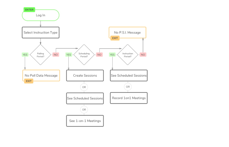
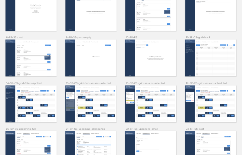
Workflow Diagramming
I began with diagramming the student and librarian workflows across each of the three periods.
STUDENT WORKFLOW DIAGRAM

LIBRARIAN WORKFLOW DIAGRAM
Wireframing / Prototyping
Once I had created the workflow diagrams, I began iterating design solutions using wireframes. I tested these wireframes using InVision. Once I had validated the usability of each peice of functionality, I moved on to high fidelity mockups.
STUDENT DASHBOARD WIREFRAMES
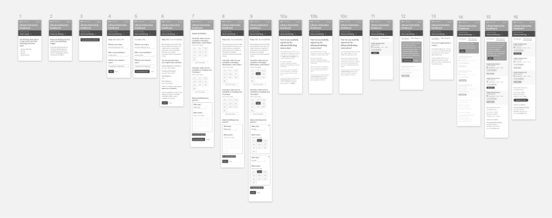
LIBRARIAN DASHBOARD WIREFRAMES

Feedback gathering from all stakeholders, iterating, and continual alignment meetings.
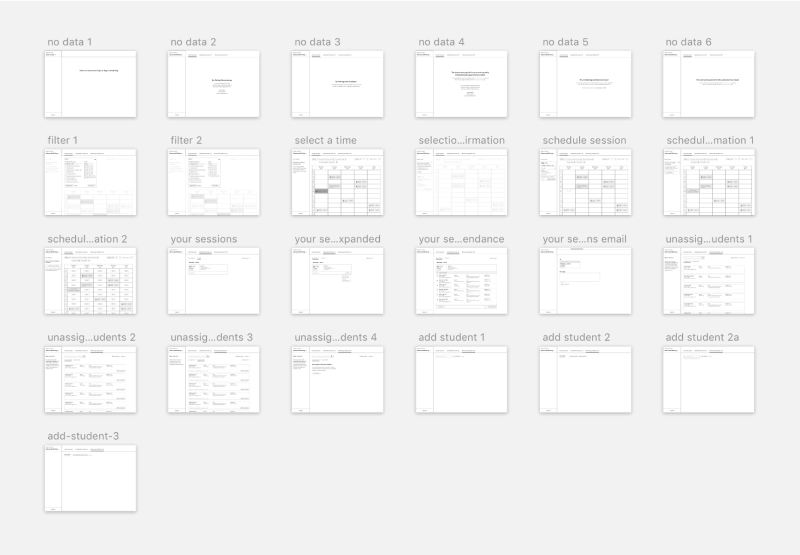
High Fidelity Mockups / Prototyping
I created and tested iterations of the high fidelity mockups using Sketch and InVision. (Back before Figma was a thing.)
At the end of this iteration cycle, I created an interaction design specification document for the developers who would be coding the JavaScript, and planning the back-end architecture.
At the end of this iteration cycle, I created an interaction design specification document for the developers who would be coding the JavaScript, and planning the back-end architecture.
STUDENT DASHBOARD HIGH FIDELITY
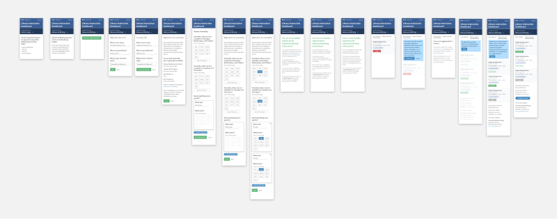
LIBRARIAN DASHBOARD WIREFRAMES
Feedback gathering from all stakeholders, iterating, and continual alignment meetings.
HTML + SCSS / Prototyping
At this point I began building what I had designed in HTML and SCSS, sent the front-end developers the interaction design doc with instructions for the JavaScript functionality on the frontend, and met with developers to talk about how the backend would need to be architected in order to support the functionality of the front-end.
View Video Walkthrough
Launch + Learn
As we launched the app, I created a feedback form in both the student and librarian dashboards that submitted directly to my email so that I could gather feedback from users.
I supported developers with any small HTML/SCSS tweaks that needed to be made after launch.
I supported developers with any small HTML/SCSS tweaks that needed to be made after launch.
ACTIVITIES
- Design to development hand off
- Design implementation support
- Feedback follow-up
DELIVERABLES
- Feedback follow-up results
Lessons Learned
- I built the production HTML/SCSS for the project—and some JS—and wished I hadn’t. I learned that I want to focus on refining the design—not on writing production front-end code. I needed this experience to teach me that. 😅
- Systems-level design is my jam—I enjoy the complexity of these types of design problems.
- Complex systems can take a long time to build, but starting with users—and testing iteratively along the way with users—can reduce that time.


