

The Outcome
We accomplished our designated charter! 🎉
While I led the process, this was a massive team effort across development, marketing, and other designers on the design team.
As of April 2021, the system was instated as the core design system for all Lendio product and marketing design teams—maintained by both development and design.
While I led the process, this was a massive team effort across development, marketing, and other designers on the design team.
As of April 2021, the system was instated as the core design system for all Lendio product and marketing design teams—maintained by both development and design.
Summary
Jessica Lim and I collaborated with stakeholders in marketing, development, and product to create a scalable, reusable, and maintainable design system that was adopted by all product teams at Lendio.
Context
At Lendio, designers are divided up into pairs and given responsibilities beyond their work projects to help build the culture of the design team. My culture team role was to partner with my fellow UX team member, Jessica Lim, to create a design system for Lendio/Sunrise designers and developers—across marketing, customer-facing product apps, and internal apps.
Timeline
December 2020–April 2021
Total Elapsed Time: ~4 months
Customer & Business Problems
FOR THE CUSTOMER(S)
As a designer at Lendio/Sunrise, I keep recreating the same components, typographic styles, and card layouts again and again. Even worse, other designers on the team are simultaneously creating similar components—all of which get past on to the developers who then create one-off versions of each similar component.
As a developer at Lendio/Sunrise, I keep rebuilding the same components, typographic styles, and card layouts again and again. Even worse, other developers across the organization are also creating similar components—creating one-off versions of each similar components throughout the code base. This make maintenance a nightmare and creates tech debt.
As a customer coming to Lendio.com or Sunrise.com, I get confused when i see different colors and styles applied across what I thought was the same site. As a result, I don’t trust Lendio as much because I can’t tell if the site is secure and being well-maintained. I'm not sure I can trust Lendio.
FOR THE BUSINESS
As a business, when designers and developers spend duplicative time designing the same UI elements, and then each development team spends additionally duplicative time building those same elements, we lose money to technical debt and maintenance costs. We also can’t build products as quickly as a result.
Our Charter
- Produce a basic scalable, reusable, and maintainable design system that standardizes components—e.g. buttons and form elements—along with typography, colors, and spacing styles and standards.
- Work with development to create these same components and styles in code and set up a governance system for adding/updating/removing components into the future.

Learn + Map
Together, Jessica and I began by documenting all of the existing pages
across the entire Lendio ecosystem—both product apps and marketing pages. From there, we identified all of the different typographic styles being used across all of these pages, along with the padding/margin amounts between elements.
across the entire Lendio ecosystem—both product apps and marketing pages. From there, we identified all of the different typographic styles being used across all of these pages, along with the padding/margin amounts between elements.
ACTIVITIES
- Identifying charter
- Identifying/auditing existing pages
- Interviewing designers
- Interviewing developers
- Interviewing marketers
- Strategic implementation planning
- Conducting comparative analysis
DELIVERABLES
- Charter reference doc
- Figma doc of existing pages
- Spreadsheet of designer responses
- Word docs of developer responses
- Word docs of marketer responses
- Strategic implementation plan
- Comparative analysis results
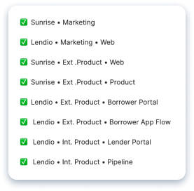
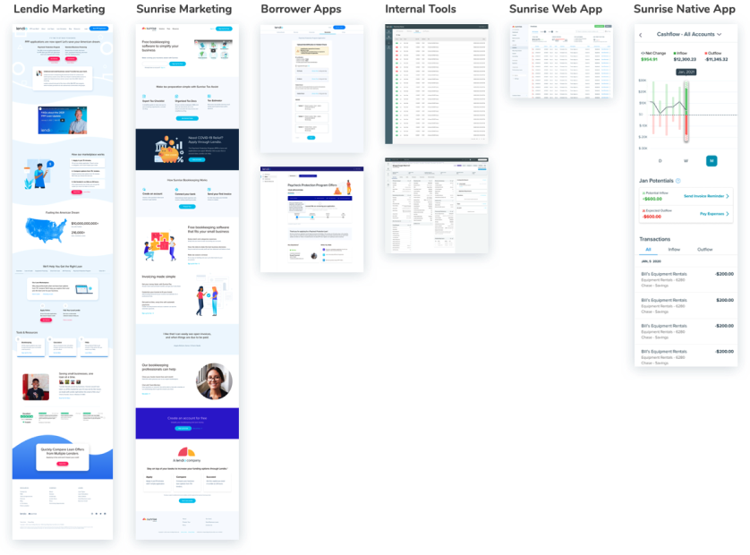
Existing Page Audit
Each of these Figma pages is representative of each app/website within the Lendio/Sunrise org.
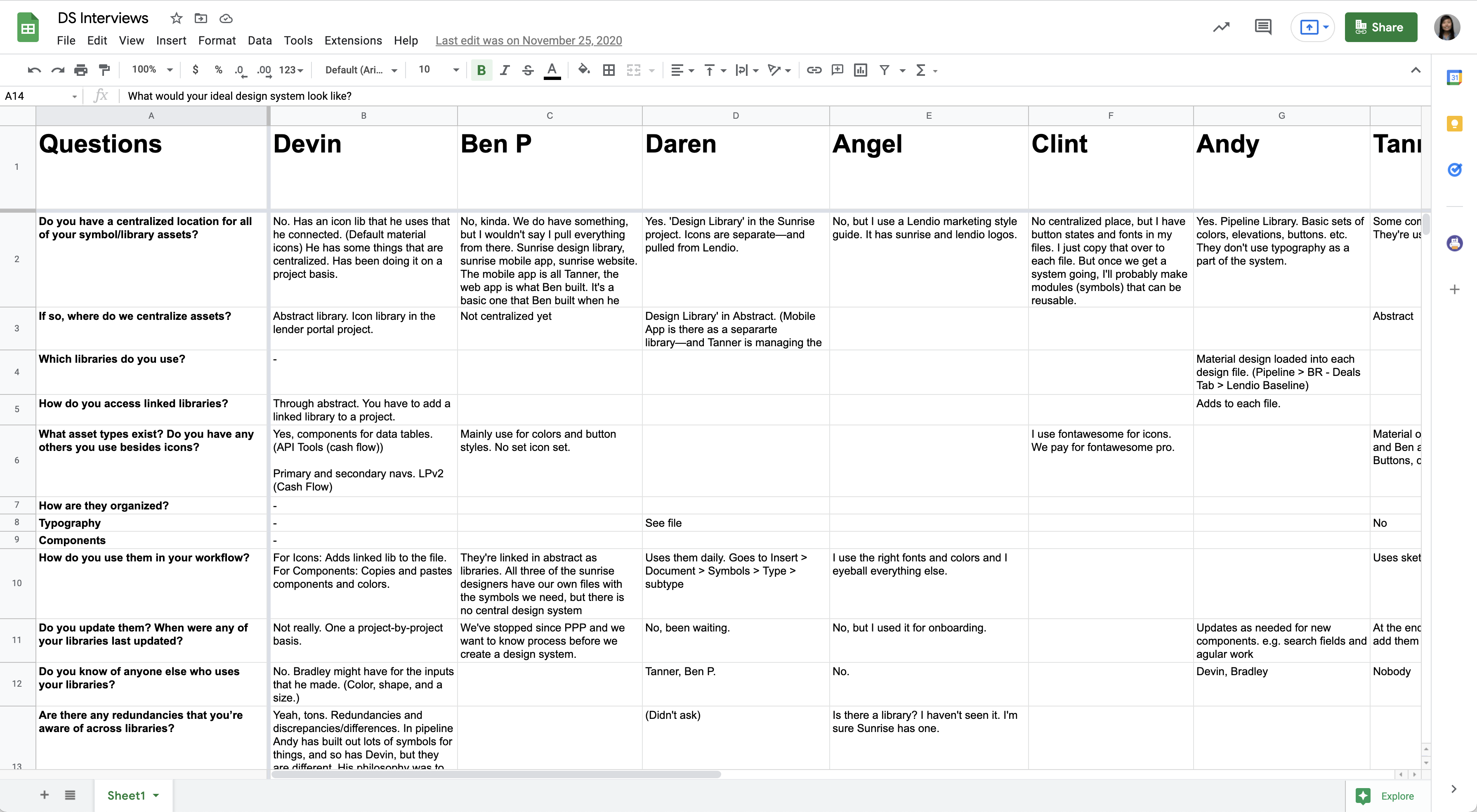
Design / Dev / Marketing Interviews
We sat down with designers, developers, and marketing and asked them a series of questions to better understand how components and styles were being shared across the team and across disciplines.
WHAT WE LEARNED
Lendio and Sunrise had grown so quickly that designers, developers, and marketers weren’t sharing nearly any components as a result. (There were also 6 typefaces being used across the apps/pages.)
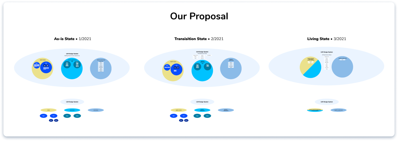
Strategic Implementation Plan
We knew that we had to start with the basics in order to get everyone aligned—especially with individual designers and developers—across two companies and multiple apps/sites.
To do this, we created a plan to get alignment on the basics: typography & grid, spacing, buttons, elevations, modals, breakpoints, and border radius.
To do this, we created a plan to get alignment on the basics: typography & grid, spacing, buttons, elevations, modals, breakpoints, and border radius.

Lendio and Sunrise had grown so quickly that designers, developers, and marketers weren’t sharing nearly any components as a result. (There were also 6 typefaces being used across the apps/pages.)
Comparative Analysis
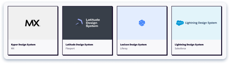
Neither Jessica, nor I, wanted to reinvent the wheel. We began by looking at what others had already put together and shared on DesignSystemsforFigma.com.

Design + Test
After comparing many of these existing systems, we decided to mimic parts of different systems to put together our own. We weren’t trying to create anything revolutionary. Instead, we were aiming to create a single source of truth for existing components and styles that could be adopted quickly and easily due to their familiarity.
ACTIVITIES
- Typographic scale creation
- Creation of spacing rules
- Creation of grid standards
- Creation of breakpoint standards
- Creation of border radius standards
- Creation of governance model
DELIVERABLES
- Documentation of type scale
- Documentation of spacing
- Documentation of grid
- Documentation of breakpoints
- Documentation of border radius
- Documentation of governance model

Feedback gathering from all stakeholders, iterating, and continual alignment meetings.
This included meeting with developers to better understand the existing front-end technologies they were using to build components currently—and that what we were designing could be aligned across these technologies. (These included Ember.js, Bootstrap 4, Vue.js, and TailwindCSS.)
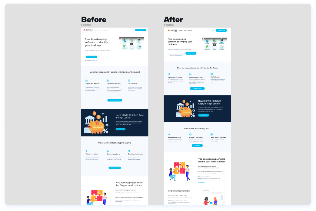
Stress Testing Where We Landed
Once we had gathered several iterations of feedback from designers, developers, and marketing on the styles and components Jessica and I had developed, I built a page from every experience using our proposed styles and components. This included experiences across Lendio and Sunrise—both internal and external-facing apps—to show stakeholders how the system could work well for their experience.
This included creating a side-by-side comparison for each app/site page to illustrate to the teams how the new system would affect their pages.
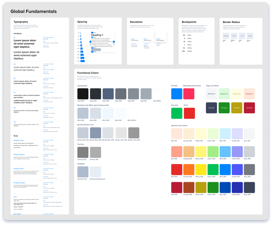
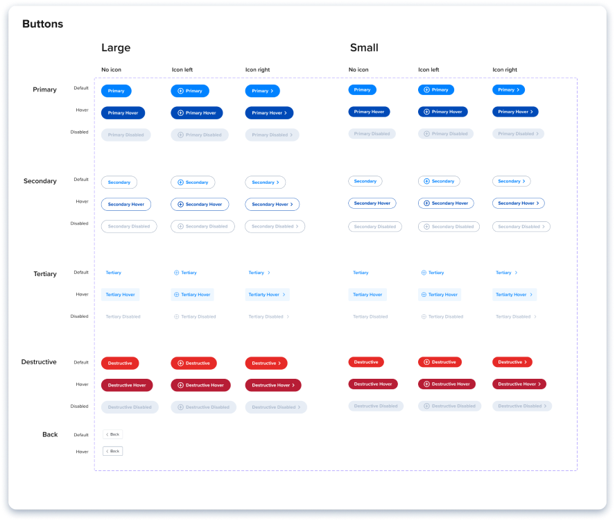
Feedback & The Final Product
Once we had stress tested the system and had resolved any concerns with stakeholders, we went to the design team and asked them to help us finish out the system by selecting a color palette as a team. Once that was done, this is where we landed for v1:
Creating the Governance Model
Now that the system had been created, we needed to create a clear way to add/update/remove new styles and components moving forward. Again, not wanting to reinvent the wheel, we started with Brad Frost’s governance model for design systems.
We than created our own from his boilerplate:
We than created our own from his boilerplate:
%201.png)

Launch + Learn
Once Jessica, the design team, and I had completed the v1 of system—with buy-in from all stakeholders—we handed off the system to the Design Ops team to implement the system with dev over the coming months.
ACTIVITIES
- Design to Design Ops hand off
- Design Ops implementation support
DELIVERABLES
- Hand off doc
- Meeting with Design Ops as needed
Lessons Learned
- Stakeholder buy-in comes when you show them how the system could work for them—and make their jobs easier.
- Giving team members the opportunity to participate in giving feedback on the system as it was built led to a sense of common ownership—which likely influenced adoption.
- Reinventing the wheel is daunting—and unnecessary. Taking inspiration and direction from existing design systems allowed us to move much more quickly, and allowed us more time to stress-test the system to ensure that it worked for all experiences.


